
TIDAL
x
TIDAL
x
Enhancing music discovery with integrated key, BPM, and genre tags — designed for DJs, playlist curators, and music lovers alike.
Enhancing music discovery with integrated key, BPM, and genre tags — designed for DJs, playlist curators, and music lovers alike.
results
the solution
the challenge
project summary
TIDAL x DJ Mode | A Self-Initiated UX Case Study (Spec Project)
Project Date | Feb 2025 - April 2025
Role | UX Designer
roadmap

DJ Mode is a speculative UX feature designed for the music streaming platform, TIDAL to help DJs and playlist curators streamline the process of selecting and organizing music, by integrating BPM, key, and genre information directly into the discovery interface.
This concept reduces cognitive load and makes it easier to build intentional playlists and DJ sets. I led the design process from user research to wireframes and high-fidelity mockups with the goal of enhancing creativity and saving time during music preparation.
One of the biggest things DJs look for when sorting music is BPM (beats per minute) and key — two essential details that help tracks blend seamlessly. But most music discovery platforms like Apple Music, Spotify, TIDAL, and SoundCloud don't display this information up front. As a result, DJs often take extra steps: Shazaming songs, manually checking BPM and key later, importing tracks into DJ software just to see if they fit, and constantly switching between apps just to stay organized.
These workarounds don’t just waste time—they interrupt flow. And let’s be honest: no one wants to spend more time on logistics than actually creating the perfect set. This isn’t just a DJ issue either. Playlist curators, like fitness instructors or vibe-setters for specific spaces, face the same problem when trying to find and organize tracks that match a particular energy.
Without a streamlined way to surface this technical info during discovery, the process becomes more about managing tools than curating sound. DJs and curators need intuitive, integrated solutions that support their creativity—not slow it down.
insights
There’s real demand for DJ Mode.
77.8% respondents said they would use DJ Mode if it were a real feature. This showed that the concept directly aligned with users’ needs and had clear potential as a practical tool for both DJs and playlist curators.

would you use dj mode?

Not seeing BPM and Key is a real pain area.
While I assumed this was just my own frustration, 25% of users said it’s a frequent issue, and 50% said it’s sometimes frustrating. This validated the core concept of making BPM and Key visible at a glance.

genre tags?
Genre tagging was more important than expected.
62.5% of respondents said they wanted genre tags visible in DJ Mode. This insight expanded the original concept beyond just BPM and Key, highlighting the need to support vibe-based curation for playlists and sets.
ideation
This feature should feel like it always belonged. The interactions should be fluid and familiar, giving the sense that DJ Mode was the missing puzzle piece. Users shouldn’t have to learn something new—it should just make sense.
simple
accessible
intuitive
The design should be visually straightforward and easy to read, presenting key information like BPM, Key, and Genre in a way that feels natural—not forced. DJ Mode is meant to blend into the app’s existing layout so that when users see it, they think, “of course that should be there.”
DJ Mode should be accessible from multiple parts of the app—whether users are actively listening to a track, browsing playlists, or digging through song details.
wireframes
In this initial wireframe, expanding a music title reveals the album cover, song title, artist name, as well as BPM, key, and genre tags. While the layout is accessible and intuitive, it lacks the simplicity I’m aiming for. The interface feels overly crowded and visually overwhelming, which made it clear that the design needed more breathing room to align with my core principles.
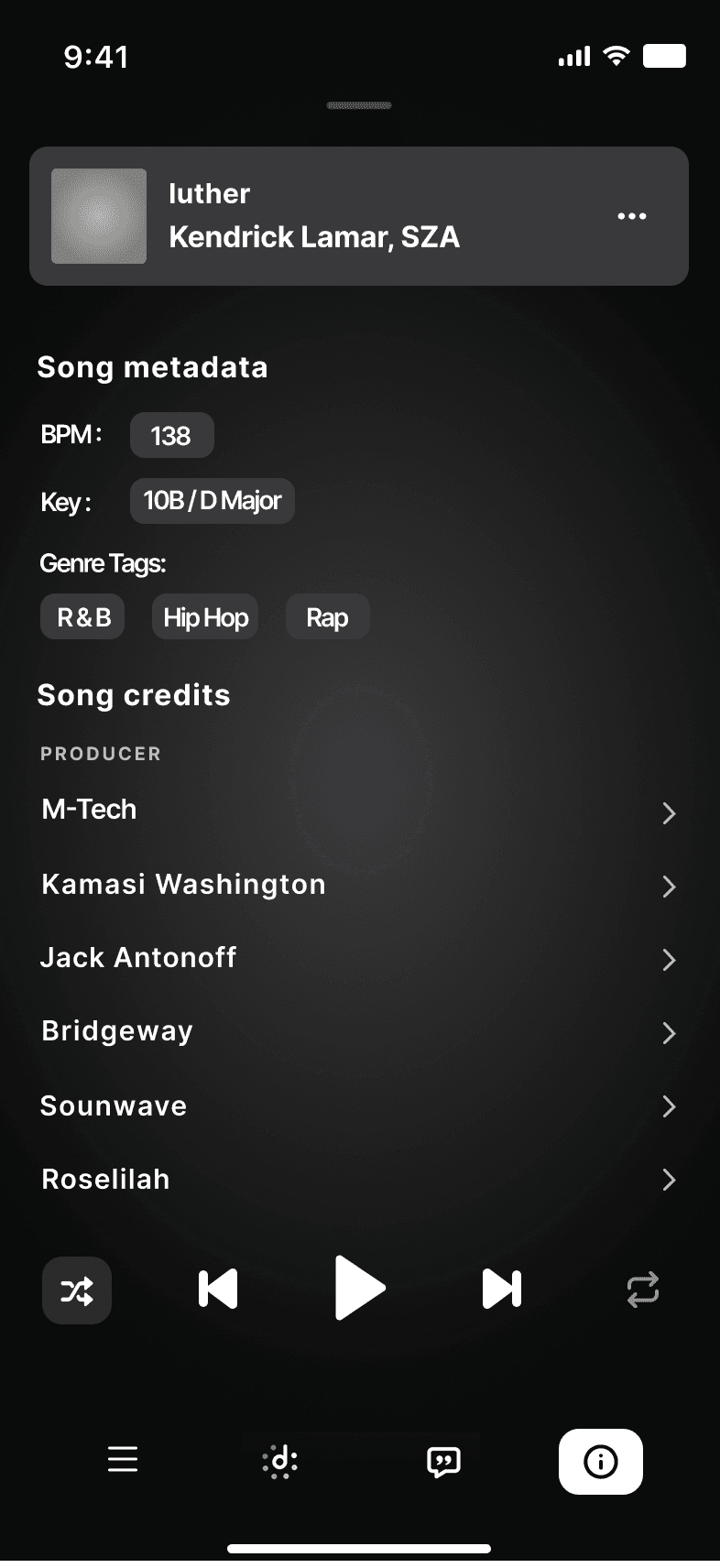
The second wireframe explored displaying DJ Mode information—such as BPM, key, and genre—alongside existing track details like song credits, label, and release date, grouped under a section labeled song metadata. This approach aligned well with the principles of simplicity and intuitiveness, as it naturally fits within the broader category of track information. However, it fell short on accessibility, since users would need to actively seek out the metadata rather than having it readily visible.
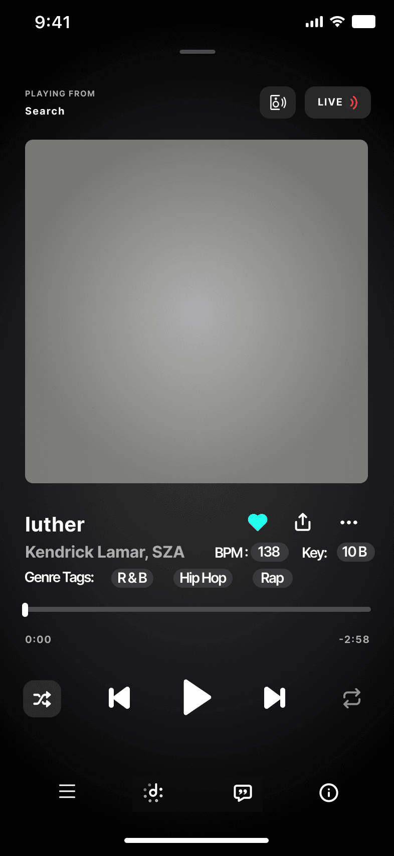
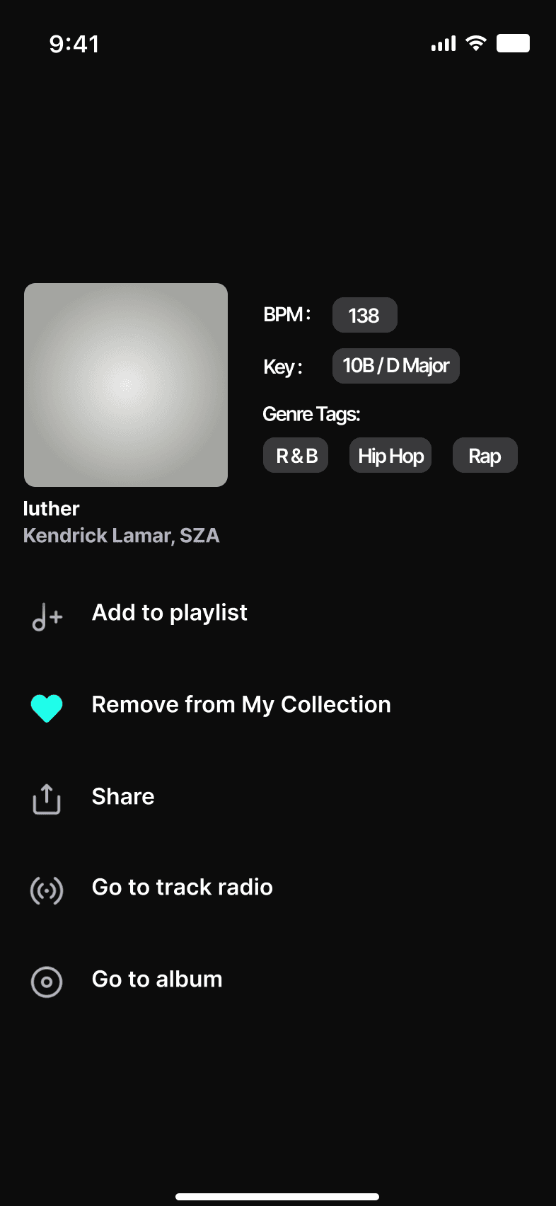
This third wireframe combines simplicity, accessibility, and intuitiveness. DJ Mode info appears when tapping the three-dot info button (…), accessible from three locations shown in the final design video below. It’s placed near the “Add to playlist” option, making it feel natural for users creating playlists. The section previously felt empty, so this addition fits seamlessly without adding clutter or causing formatting issues.
final design
While DJ Mode is a conceptual feature, the final design reflects clear user demand by integrating BPM, Key, and Genre metadata directly into TIDAL’s interface. It aligns with the principles of simplicity, accessibility, and intuitiveness by making DJ Mode available through the familiar three-dot menu in three key locations: while listening to a current song, searching for a song, and browsing the track library.
Placing DJ Mode here keeps it within the user's natural flow and situates it near the “Add to Playlist” option—making it feel like a seamless and logical part of the playlist-building experience.
Lessons Learned
This project gave me a deep dive into the interface of UX design—specifically in creating a feature I’m passionate about. I learned how to leverage existing resources and draw inspiration from well-established platforms, allowing me to create within an existing ecosystem. As someone with no prior UX knowledge, I’m incredibly proud of the research I conducted, the process I followed, and how I used those insights to shape a design that was both usable and visually appealing.
Design Evolution
One of the most rewarding aspects was seeing how the design evolved from concept to tangible mockups. Starting from scratch, I learned to push through uncertainties and use the feedback loops effectively. The challenge of creating a functional yet aesthetically pleasing interface was a driving force, and the final design reflects a balance between usability and visual design.
Next Steps…
Moving forward, I’d love to take this project further by testing the feature in real-world scenarios, especially with real users to gather hands-on feedback. I also plan to keep refining my skills, experimenting with new ways to improve accessibility and usability. I’m eager to integrate new ideas into future projects and continue growing as a UX designer!
TIDAL x DJ Mode | A Self-Initiated UX Case Study (Spec Project)
Project Date | Feb 2025 - April 2025
Role | UX Designer
TIDAL x DJ Mode | A Self-Initiated UX Case Study (Spec Project)
Project Date | Feb 2025 - April 2025
Role | UX Designer
roadmap
roadmap
project summary
project summary
challenge
challenge
solution
solution
results
results
reflections
reflections
project summary
project summary
DJ Mode is a speculative UX feature designed for the music streaming platform, TIDAL to help DJs and playlist curators streamline the process of selecting and organizing music, by integrating BPM, key, and genre information directly into the discovery interface.
This concept reduces cognitive load and makes it easier to build intentional playlists and DJ sets. I led the design process from user research to wireframes and high-fidelity mockups with the goal of enhancing creativity and saving time during music preparation.
the challenge
the challenge
One of the biggest things DJs look for when sorting music is BPM (beats per minute) and key — two essential details that help tracks blend seamlessly. But most music discovery platforms like Apple Music, Spotify, TIDAL, and SoundCloud don't display this information up front. As a result, DJs often take extra steps: Shazaming songs, manually checking BPM and key later, importing tracks into DJ software just to see if they fit, and constantly switching between apps just to stay organized.
These workarounds don’t just waste time—they interrupt flow. And let’s be honest: no one wants to spend more time on logistics than actually creating the perfect set. This isn’t just a DJ issue either. Playlist curators, like fitness instructors or vibe-setters for specific spaces, face the same problem when trying to find and organize tracks that match a particular energy.
Without a streamlined way to surface this technical info during discovery, the process becomes more about managing tools than curating sound. DJs and curators need intuitive, integrated solutions that support their creativity—not slow it down.
the solution
the solution
insights
insights

There’s real demand for DJ Mode.
5 out of 8 respondents said they would use DJ Mode if it were a real feature. This showed that the concept directly aligned with users’ needs and had clear potential as a practical tool for both DJs and playlist curators.
There’s real demand for DJ Mode.
5 out of 8 respondents said they would use DJ Mode if it were a real feature. This showed that the concept directly aligned with users’ needs and had clear potential as a practical tool for both DJs and playlist curators.
would you use dj mode?
would you use dj mode?
Not seeing BPM and Key is a real pain point.
While I assumed this was just my own frustration, 25% of users said it’s a frequent issue, and 50% said it’s sometimes frustrating. This validated the core concept of making BPM and Key visible at a glance.
Not seeing BPM and Key is a real pain point.
While I assumed this was just my own frustration, 25% of users said it’s a frequent issue, and 50% said it’s sometimes frustrating. This validated the core concept of making BPM and Key visible at a glance.
genre tags?
genre tags?
Genre tagging was more important than expected.
62.5% of respondents said they wanted genre tags visible in DJ Mode. This insight expanded the original concept beyond just BPM and Key, highlighting the need to support vibe-based curation for playlists and sets.
Genre tagging was more important than expected.
62.5% of respondents said they wanted genre tags visible in DJ Mode. This insight expanded the original concept beyond just BPM and Key, highlighting the need to support vibe-based curation for playlists and sets.
ideation
ideation
This feature should feel like it always belonged. The interactions should be fluid and familiar, giving the sense that DJ Mode was the missing puzzle piece. Users shouldn’t have to learn something new—it should just make sense.
simple
simple
accessible
accessible
intuitive
intuitive
The design should be visually straightforward and easy to read, presenting key information like BPM, Key, and Genre in a way that feels natural—not forced. DJ Mode is meant to blend into the app’s existing layout so that when users see it, they think, “of course that should be there.”
The design should be visually straightforward and easy to read, presenting key information like BPM, Key, and Genre in a way that feels natural—not forced. DJ Mode is meant to blend into the app’s existing layout so that when users see it, they think, “of course that should be there.”
DJ Mode should be accessible from multiple parts of the app—whether users are actively listening to a track, browsing playlists, or digging through song details.
DJ Mode should be accessible from multiple parts of the app—whether users are actively listening to a track, browsing playlists, or digging through song details.
This feature should feel like it always belonged. The interactions should be fluid and familiar, giving the sense that DJ Mode was the missing puzzle piece. Users shouldn’t have to learn something new—it should just make sense.
wireframes
wireframes
In this initial wireframe, expanding a music title reveals the album cover, song title, artist name, as well as BPM, key, and genre tags. While the layout is accessible and intuitive, it lacks the simplicity I’m aiming for. The interface feels overly crowded and visually overwhelming, which made it clear that the design needed more breathing room to align with my core principles.
In this initial wireframe, expanding a music title reveals the album cover, song title, artist name, as well as BPM, key, and genre tags. While the layout is accessible and intuitive, it lacks the simplicity I’m aiming for. The interface feels overly crowded and visually overwhelming, which made it clear that the design needed more breathing room to align with my core principles.
The second wireframe explored displaying DJ Mode information—such as BPM, key, and genre—alongside existing track details like song credits, label, and release date, grouped under a section labeled Song Metadata. This approach aligned well with the principles of simplicity and intuitiveness, as it naturally fits within the broader category of track information. However, it fell short on accessibility, since users would need to actively seek out the metadata rather than having it readily visible.
The second wireframe explored displaying DJ Mode information—such as BPM, key, and genre—alongside existing track details like song credits, label, and release date, grouped under a section labeled Song Metadata. This approach aligned well with the principles of simplicity and intuitiveness, as it naturally fits within the broader category of track information. However, it fell short on accessibility, since users would need to actively seek out the metadata rather than having it readily visible.
This third wireframe combines simplicity, accessibility, and intuitiveness. DJ Mode info appears when tapping the three-dot info button (…), accessible from three locations shown in the final design video below. It’s placed near the “Add to Playlist” option, making it feel natural for users creating playlists. The section previously felt empty, so this addition fits seamlessly without adding clutter or causing formatting issues.
This third wireframe combines simplicity, accessibility, and intuitiveness. DJ Mode info appears when tapping the three-dot info button (…), accessible from three locations shown in the final design video below. It’s placed near the “Add to Playlist” option, making it feel natural for users creating playlists. The section previously felt empty, so this addition fits seamlessly without adding clutter or causing formatting issues.
final design
final design
reflections
reflections
results
results
While DJ Mode is a conceptual feature, the final design reflects clear user demand by integrating BPM, Key, and Genre metadata directly into TIDAL’s interface. It aligns with the principles of simplicity, accessibility, and intuitiveness by making DJ Mode available through the familiar three-dot menu in three key locations: while listening to a current song, searching for a song, and browsing the track library.
Placing DJ Mode here keeps it within the user's natural flow and situates it near the “Add to Playlist” option—making it feel like a seamless and logical part of the playlist-building experience.
Lessons Learned
This project gave me a deep dive into the interface of UX design—specifically in creating a feature I’m passionate about. I learned how to leverage existing resources and draw inspiration from well-established platforms, allowing me to create within an existing ecosystem. As someone with no prior UX knowledge, I’m incredibly proud of the research I conducted, the process I followed, and how I used those insights to shape a design that was both usable and visually appealing.
Design Evolution
One of the most rewarding aspects was seeing how the design evolved from concept to tangible mockups. Starting from scratch, I learned to push through uncertainties and use the feedback loops effectively. The challenge of creating a functional yet aesthetically pleasing interface was a driving force, and the final design reflects a balance between usability and visual design.
Next Steps…
Moving forward, I’d love to take this project further by testing the feature in real-world scenarios, especially with real users to gather hands-on feedback. I also plan to keep refining my skills, experimenting with new ways to improve accessibility and usability. I’m eager to integrate new ideas into future projects and continue growing as a UX designer!